Good Day Cork - Case Study
Using WordPress, HTML, CSS, and Elementor to redesign a website by following best UX/UI Design practices.

Marcelle Louise
●
15 min read

Brief
Good Day Cork is a positive media and events space dedicated to changing the narrative by tackling under-represented minority communities. Based in the city of Cork, Joanna Dukkipati interviews locals and discusses subjects such as liberty, equality, and justice.
In September 2018, their first magazine was published by the name "Good Day News" but soon enough there was the need to transition to a digital system. The website was created in May 2021 with WordPress and Elementor. So far, the team has been using templates to design the Front End. However, the design was limited and lead the users to get frustrated and not spend enough time on certain pages.
Project Goals
-
Use available insights to project a new user flow
-
Upgrade design to provide a greater user experience
-
Boost subscriptions and website traffic
-
Improve UX writing by working together with a SEO expert
-
Fix HTML and CSS bugs
It allows us to dip into our own reservoirs of self-compassion, creativity, and positivity, it move us forward.
Aoife Barry, Journalist
About Good Day Cork

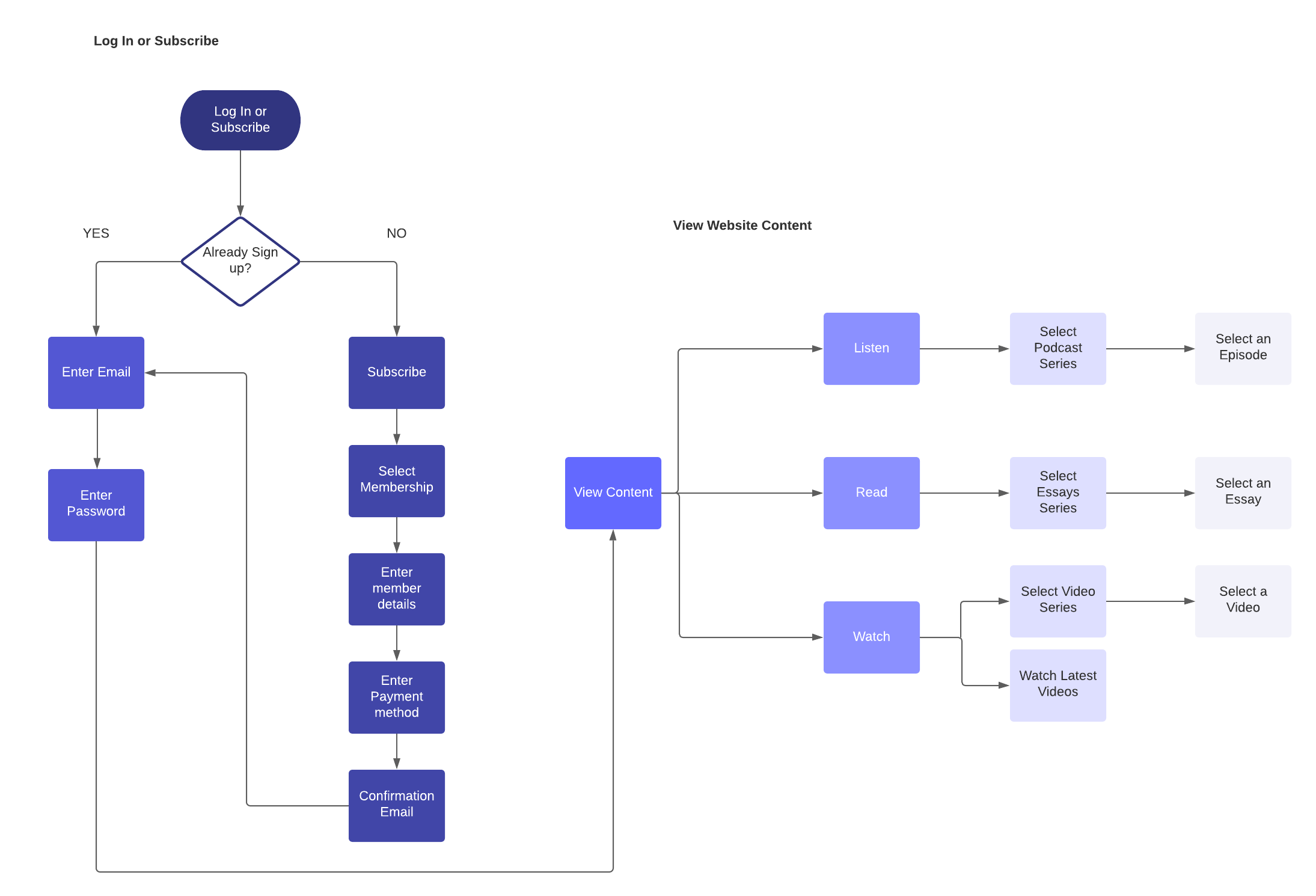
User Flow
By understanding the user's needs and motivations, we were able to review the current pathways they take to complete an action. Developing a greater user flow will impact the way interact with the website and we will be able to see the results after testing it.
Prototypes
Following the user's needs and the company's requirements, a wireframe was created to represent the design solution for the Home page. Further improvements were performed once the Front End Development started.

Development
Typography
The font family for the website was initially Tahoma. However, due to the lack of weights available, we could only opt from bold to thin weight. For this reason, we changed it to Roboto, which is a sans-serif user-friendly and easy-to-read font. This was an important step during this process, as we needed to ensure that the users would feel comfortable with this font but also identify text quickly.
Before

After

Navigation Bar
The previous navigation bar presented the social icons, log-in icon, logo, and 7 links to different pages. After going through each page, we decided to separate them into three groups: primary, secondary, and tertiary elements.
In the primary group, we will have the logo, the 3 main content pages, a Subscribe button, and the login option. In the secondary, we kept the Contact page but added the About Us page and a search button so the users can easily find a particular essay or podcast.

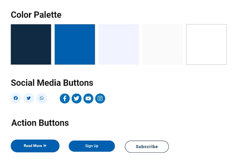
Style Guide
There was a non-defined style guide, with different colors that did not match. After carefully reviewing it, we were able to create a new style guide to define the colors, buttons, and typography.
Conclusion
The main requirements were achieved once the development phase started and we observed a growth in the subscriptions by 40% since the new website was launched. However, this is an ongoing project, therefore we are currently working on gathering user feedback and testing the improvements made so far to iterate future goals.